According to Google Analytics, about 1/3 of the visitors to this site are on a mobile phone, while around 10% of my total traffic stem from tablets.
And I imagine that these numbers will continue to get higher with the advancement of technology, decrease in prices, and wider adaptation of mobile devices.
When I first set out to design this current WordPress theme, my original plan was to make it responsive.

A responsive design changes the layout of a page depending on the size of the screen. (image source)
However, I was too eager to get a new template prepared that I did not thoroughly study up on the method I said “Screw it” and took the easier route of a static design.
As more and more people are using their smartphones and/or tablets in lieu of a standalone computer, the thought that I should make this blog more mobile-friendly has been constantly weighing on my mind.
But…it’s a lot of work. And I would have to choose between two methods —
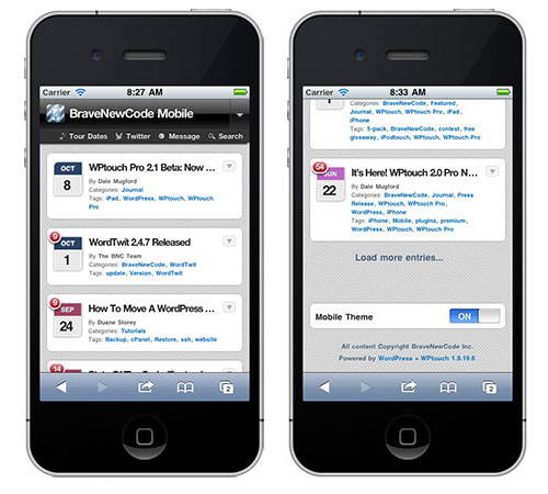
The first is a plugin that would easily create a mobile version of this WordPress blog. I would most likely go with WPtouch, which would turn my frontpage into something like this:
Notice that in the right screen, there is an option to turn off the mobile theme, which I really like. 🙂
The biggest con to this method is that — as you can see — the mobile version of my site would be very bare-bones and frankly, kinda ugly. Not to mention the fact that you would need to click on each post to view anything further than the title and metadata, which I know a lot of my readers hate.
That being said, if I do decide to go with WPtouch, I will most likely invest in the pro version somewhere down the road. WPtouch Pro allows for much more customization, as you can see below:
The second option is to go with my original plan with a responsive layout. I’ve even found a method that gives users the option to view the site in full mode.
But, once again, it’s A LOT of additional work on my part. (And I don’t want to pay someone to do it for me when I can do it myself.) Additionally — and I know I’m in the minority here — I’m just not a big fan of responsive design. ManageWP has a great article titled “5 Reasons Why Responsive Design Is Not Worth It” with which I wholeheartedly agree.
So the biggest question standing in the way of my turning my site responsive is: is all the additional work worth it? Do my readers even care about this stuff?
What do you guys think? I’d love to get your opinions on the matter, and possibly even learn about other options.
[poll id=”5″]


 I like books, gadgets, spicy food, and art. I dislike shopping, hot weather, and the laws of entropy. Although I am a self-proclaimed computer nerd, I still have a love for handbags and makeup... and I am always teetering on high heels. To learn more about me, visit the


Try squarespace. It offers great templates, easy conversion from wp, and responsive design baked in. They also can handle hosting and domain services. The sites look fantastic as they are, but you can also customize very easily.
I actually used to host this blog from Squarespace, and I still have a lifetime account with them. (See https://www.geekinheels.com/2008/07/28/squarespace-v5-review.html where I was asked to be a beta tester for the V5.) However, I have made the transition to WordPress for various reasons, some of which are listed here: https://www.geekinheels.com/2011/01/17/new-year-new-look-new-platform.html
I don’t like mobile versions, and I don’t like responsive design – keep it the way it is! 🙂 My husband is the exact opposite – he gets angsty when sites don’t have a mobile version. But, he does not read your blog, so ignore him. 🙂
I prefer to view full sites. I notice that mobile versions are always lacking, and I always scroll to the bottom for the link to the full site.