The answer is YES.
Last month, I saw a screenshot of the Fujinon Binoculars website source code. Filled with seemingly endless <FONT> tags, I couldn’t help but laugh.
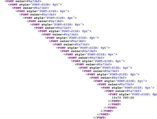
A snippet of the code. Take a look at the original to get the full effect.
THIS is the reason I never use an HTML editor, I chuckled as I scrolled down the overly bloated code.
But alas! Today I found out that there was a reason behind this madness!
According to b3ta.com, this is what you get when you zoom out and flip the code on its side:
It almost looks like a landscape, doesn’t it?
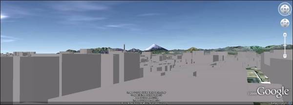
Now, when we travel – via Google Earth – to the top of Fujinon’s corporate headquarters in Saitama and face Mount Fuji, we get this view:
Let’s try laying the code over the landscape:
A.MAZING.
Those darned kewl Japanese! What will they think of next??!
Via Geeks Are Sexy.





 I like books, gadgets, spicy food, and art. I dislike shopping, hot weather, and the laws of entropy. Although I am a self-proclaimed computer nerd, I still have a love for handbags and makeup... and I am always teetering on high heels. To learn more about me, visit the
