I hate Captcha systems and find them extremely irritating. It’s not only the act of having to type out the characters on screen, but the fact that deciphering some Captcha systems can be immensely difficult makes me feel less of a human somehow. (Because you know, the whole point of having Captcha systems in place is to weed out the bots.)
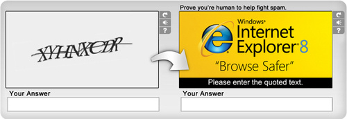
Enter Solve Media, a start-up based in New York. Solve has decided that Capcha systems are not annoying enough on their own — they must be supplemented by another major annoyance of the web: online ads.

As Solve sees it, their new Captcha advertisements will not only benefit advertisers by forcing visitors to look at — and comprehend — the ad, but will also rescue visitors from having to distinguish characters that are growing increasingly difficult to decipher. And advertisers are certainly jumping aboard, as AOL, Toyota, GE, and Microsoft have all already signed up.
Personally, I’m not sure which is more annoying: trying to figure out whether a squiggly character is a 7 or a T, or being forced to look at an ad to proceed to my next step in web browsing.
One thing is for certain. The new Captcha advertisements may be evil, but the idea is undeniably brilliant.
Via Gizmodo.


 I like books, gadgets, spicy food, and art. I dislike shopping, hot weather, and the laws of entropy. Although I am a self-proclaimed computer nerd, I still have a love for handbags and makeup... and I am always teetering on high heels. To learn more about me, visit the


As much as I hate advertising, I think I would rather read some legible space rather than the annoying squiggles that I always get wrong!
You are right though, it is a brilliant idea.
Word verification (or "Captcha" I guess it's called?) truly frustrates me. I still visit blogs and comment because they are great, but I wish the word verification step was gone!
If you have Akismet, Captchas are unnecessary. Since I installed it, I haven't had to moderate any comments.
@Zach — Captcha systems do not solely exist on blogs. They're on forums, contact forms…basically anywhere you can find online forms.
i just saw your portfolio and had a question (great work btw!) – what programs did you use for the flyers/guides? i'm working on a newsletter at work using Publisher, but am taking suggestions for other software too 🙂
thanks!
Hey!!!!!!!!!! I think I would rather read some legible space rather than the annoying squiggles that I always get wrong!
You are right though, it is a brilliant idea.Thanks lot…………..
Interesting! If I am forced to type something in, I prefer them to be right on the page with the comment, not a pop-up. Also, I like the one that is a basic math problem – 1+1 and you have to enter 2. Easy! 🙂