Ever since coming home with the new baby, I haven’t been able to delve into my 1,000+ Google Reader subscriptions and I feel no guilt or qualms about it as I normally would have. (And I plan on cutting back on my number of subscriptions in the near future so that I don’t drive myself crazy!)
But last night, as I re-started my browser, this particular item jumped out at me and I can’t help but share it now with my readers…
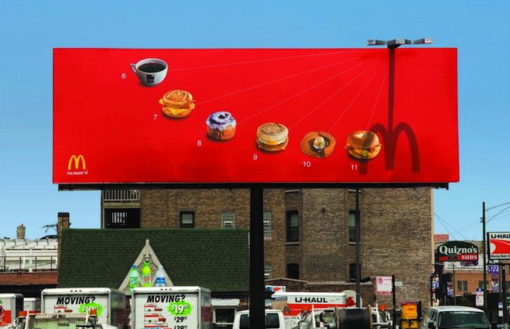
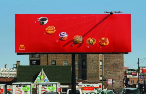
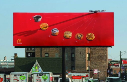
Designed by ad agency Leo Burnett, this McDonald’s billboard showcases some of the fast food chain’s most popular breakfast items — with a twist: the sun casts a Golden Arch shadow on the item that corresponds to the time of day you would normally eat it!
According to My Modern Met, Leo Burnett enlisted the help of an engineer to find the perfect location for the billboard so that the sundial could have its desired effect. Absolutely brilliant, wouldn’t you say?


 I like books, gadgets, spicy food, and art. I dislike shopping, hot weather, and the laws of entropy. Although I am a self-proclaimed computer nerd, I still have a love for handbags and makeup... and I am always teetering on high heels. To learn more about me, visit the

How clever!! That really is brilliant advertising!
Wow – that is genius!!
Wow, that’s definitely smart advertising. The only billboard that’s had a lasting impression on me had a gigantic 3D burger attached to it (In-N-Out). Even though I haven’t seen the McDonald’s one in person, I don’t think I’ll ever forget it.
This is quite remarkable! This advertisement jumps at you like the broad side of a barn!! Hahahahahahahahaha *Wipes tear* I’m so funny… 😉
Until I look at the picture again and realize that this is a billboard, and not a part of the building in the background of the picture.. I now feel a little silly and am going to get another cup of coffee…