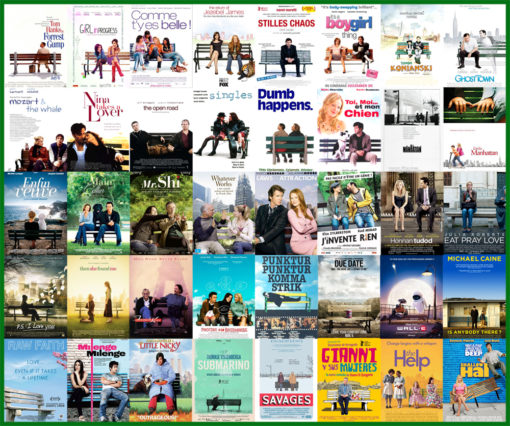
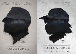
I do not pay too much attention to movie posters, so it comes as no surprise that I have never noticed these clichés before. I guess that the movie advertising business is similar to other design-related fields in that they know what works, and/or are fresh out of original ideas.
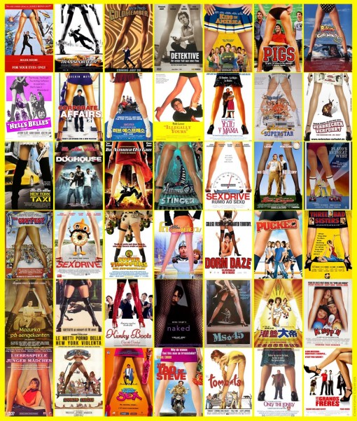
Between the legs:
Black and white with colored flames:
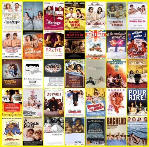
Lying in bed:
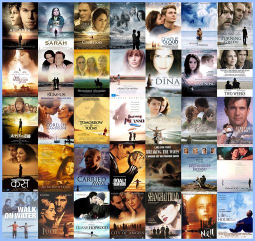
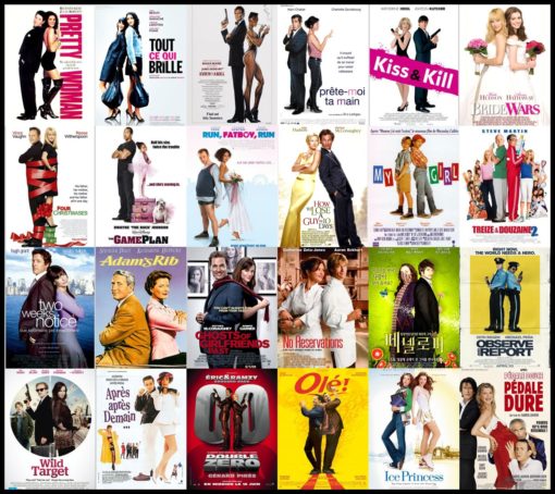
Big heads in the sky over tiny people on the beach:
Back to back:
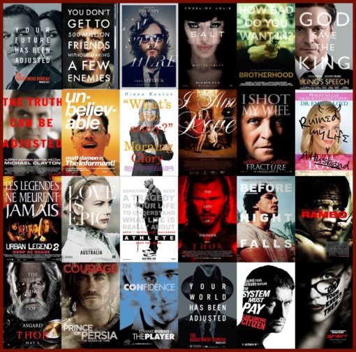
Large text over faces:
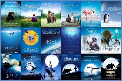
Blue nature-themed:
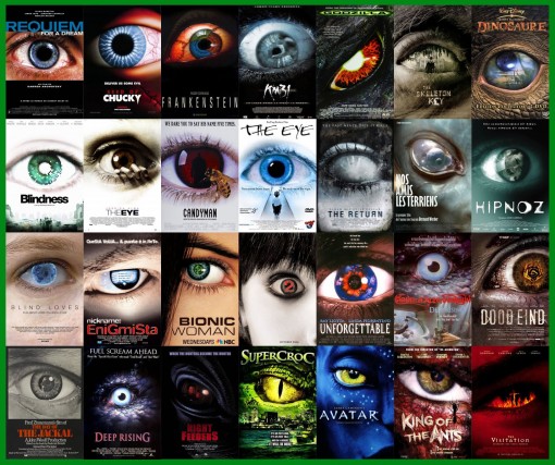
One big eye:
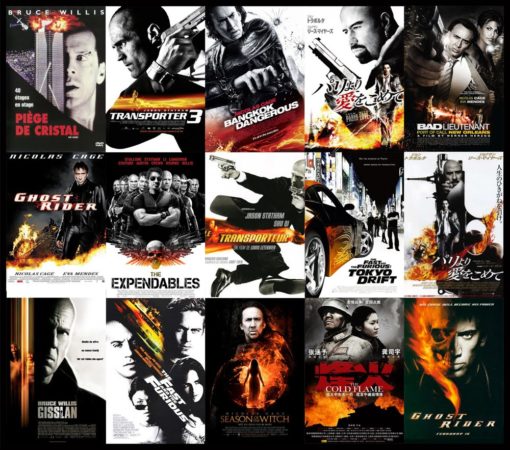
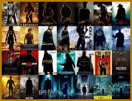
From the back (often with weapons):
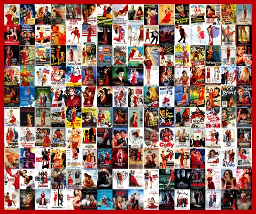
The red dress:
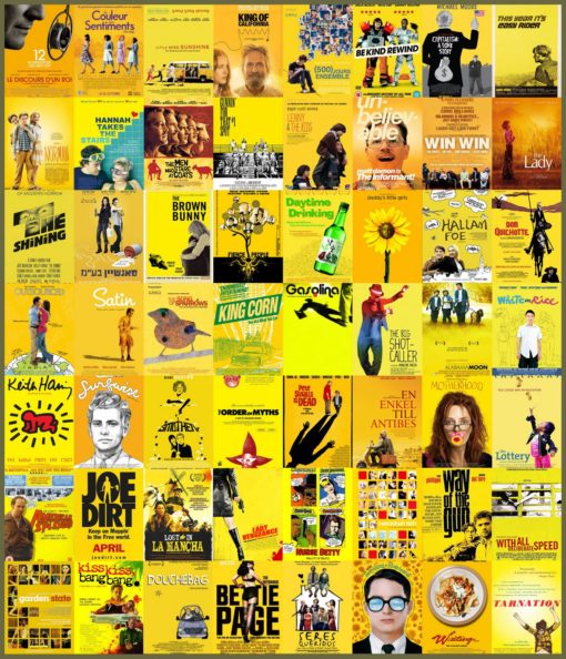
Yellow indie film poster:
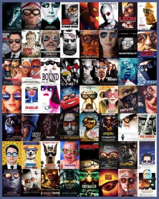
Reflection in sunglasses:
On a bench:
Go visit Le Sibère Carnet de Christophe Courtois (note: site in French) for more!



 I like books, gadgets, spicy food, and art. I dislike shopping, hot weather, and the laws of entropy. Although I am a self-proclaimed computer nerd, I still have a love for handbags and makeup... and I am always teetering on high heels. To learn more about me, visit the

Hahaha the “big heads in the sky over tiny people on a beach” is a thing??? That one was the most surprising to me!
I clicked through my google reader to your site because the images weren’t loading and they’re all showing up as being “hotlinked”. I had to giggle considering you just did the tutorial on hotlinking and how to prevent it.
Anyhow, I didn’t even realize how true this was, and I watch a lot of movies… I’ll probably be checking covers more often now!
So sorry about that — the way that it’s set up, any google.com addresses are exempt from hotlink protection. Is there a chance that you were behind a firewall?
Ha! I’ve never noticed this before either!
hahaha these are great! i always noticed the big heads across the sky theme!!