Before I begin, I should add a disclaimer that my husband works for AOL. More specifically, he works for a new R&D department at AOL that creates new apps which may be used internally or externally by the former-ISP-giant-turned-internet-publisher.
(Many people don’t realize that AOL owns some of the most popular blogs out there, like HuffPo, TechCrunch, and Engadget. I’m a bit ashamed to admit that even I asked, “Wait, AOL’s still around?” when he was interviewing with them. 😳 )
You’ve probably deduced by now, by the title of this post and the first paragraph, that J’s team is the one behind AOL Reader. 🙂
So it’s safe to assume that I’m a bit biased.
BUT.
I still believe AOL Reader to be the best replacement for Google Reader. (Go, husband and his team!)
And I know I’m not the only one — the ones who actually tried the product with an open mind (and not immediately eschewed it for having “AOL” in its name)…
And gave it a go recently and not right after the private beta was revealed (yes, the first release was buggy, but that’s only because the planned release date was moved up due to someone in another company leaking the site, violating an NDA 👿 )…
They not only agree that it’s not a bad product, but that it “has promise,” and that it’s a pretty solid candidate!
I’ll get to the nitty gritty below, but before I do that, I want to highlight my three favorite things about AOL Reader:
- It is SIMPLE and FAST, with the option to add additional bells and features if you wish.
- It is still a work in progress, meaning that new features are being added every day. I’m especially excited about the following, which are in development right now:
- Search — one of the things I dislike most about Feedly is that I’m not able to search my feeds for articles I have read in the past.
- Native iOS and Android apps
- Share — remember when you could share certain articles with fellow Google Reader users? Yeah. AOL Reader will have that soon. 🙂
- Once again, because it’s still in beta, the team is very open to your suggestions and feedback!
Now, on to my review…
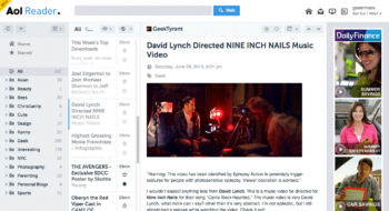
AOL Reader’s interface is fairly minimalistic with two color themes: light and dark. (And I’m guessing that somewhere down the road, third-party coders and designers will create new themes, as the API is readily available.) I have mine set to light, but I believe the default is dark.
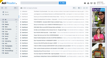
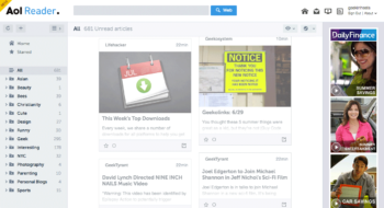
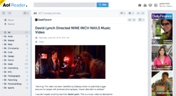
There are four view types: list (like the classic Google Reader), card (like Feedly), article (full view), and pane (similar to Outlook).
(It’s worth mentioning that if your browser window is less than 1250px wide, the pane view will transform to north-south, instead of east-west as shown above. I wish there is a way to control this manually. When I asked J about it, he said this is due to the responsive UI.)
When the beta was first released, numerous people — including myself — complained that the feed wasn’t updating fast enough. I’m glad to say that in the past few days, it has been updating every few minutes as all my previous RSS aggregators have done. 🙂
I also saw many complaints about the lack of a one-click import from Google Reader. Seriously, people? Importing your subscriptions via an OPML file takes just a few more clicks. (See here to see how to export your Google Reader subs.) Nonetheless, this is now remedied too — if you are logged into your Google account, AOL Reader can import your subscriptions via a one-click import button.
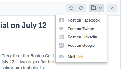
As is the case with other RSS aggregators, each article can be shared with popular social media outlets. You can also mark the article as being important by clicking on the star button, or save it for later with the circle button (which keeps it unread).
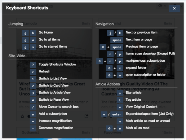
Keyboard shortcuts are readily available too, and just in case you don’t remember them, just hit the question mark on your keyboard and the following menu pops up:
Now, for the things I’m not liking so much…
First up is the lack of the feed title in the pane view. I’ve mentioned this to J and he says that they’re working on it. (I’m assuming it’s a relatively easy fix?)
Secondly, I would like for the author of each post to appear alongside the titles. These days, many blogs have multiple contributors and I like to see whose article I’m reading.
My third issue with AOL Reader is its lack of certain CSS support in displaying the feeds, particularly in regards to images and DIV tags. As a result, some articles lose the formatting the authors — like me! — add to their posts.
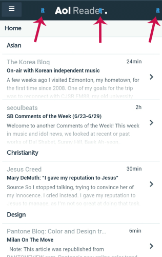
The fourth is the mobile version (which can be accessed by simply visiting http://reader.aol.com on your mobile device) — and there are three issues I have with the current mobile version:
- Each feed item appears under its category/folder name. I wish this wasn’t the case (as it wastes valuable real estate), or that we can toggle it on and off.
- There is currently no “mark all as read” button for the mobile version. I’d really like to see one, because when I have hundreds of articles to read, I like to skim through the titles and be able to mark everything as read.
- Perhaps this is just my phone, but what are these little blue guys at the top of the screen?
If you zoom in, it kinda looks like a little blue dog:

Anyone care to take a gander? (J says that this isn’t showing on other mobile browsers they’ve tested on, so they’re working on figuring this out. However, it’s not a priority.)
So as you can see, AOL Reader is certainly far from perfect. But it is still in beta, and it’s only expected that some bugs still remain, especially as the user base expands and it continues to be used in different settings and environments.
As for the tower ad on the right side of the page? Eh, I’m so used to ads by now that as long as it’s unobtrusive (i.e., no pop-ups, pop-unders, or automatic sound/music playing), I’m fine with them. Besides, having an ad ensures that the product will generate some sort of revenue and will not get the axe, as Google Reader did.
Are you still reading? If you are — and you’re interested in trying the new AOL Reader — I’ve got a small treat for you! Right now, AOL Reader is still in private beta testing phase, which means that you have to be placed on a waiting list to be granted access.
If you don’t want to wait and want access ASAP, tell me the email address you used to sign up for the invite (either in the comments below or via my contact form) and I’ll forward your email along to J to get you moved to the top of the waiting list!
Please make sure you’re already on the list before contacting me, because we can’t help you otherwise. 🙂
Not convinced AOL Reader is right for you, and still looking for a good Google Reader replacement? Slate recently published a flowchart of numerous Google Reader alternatives here. For those who are having trouble with the click-and-drag interface (as was the case for me), here it is below:
I hope you enjoyed this review, and I hope you enjoy AOL Reader as much as I do!
Questions? Comment below, or go straight to the AOL Reader Feedback page!





 I like books, gadgets, spicy food, and art. I dislike shopping, hot weather, and the laws of entropy. Although I am a self-proclaimed computer nerd, I still have a love for handbags and makeup... and I am always teetering on high heels. To learn more about me, visit the

I used the email ahrin2u@gmail.com. I’m using feedly, but am curious what this will be like after hearing it.
Hi, I’d like to try this out as well.
I have signed up with the address used to comment here
Thanks
Seems like i have been activated
For news reading, you can also use http://www.hinto.co
It’s a highly visual web app that allows you to select which websites contents to keep up with.
Yay for J! I was a little hesitant at first but the screenshots really sold me! I’m on the beta list for now
I signed up with the address I used to comment. I’ve been using Google Reader and the Old Reader on PC and feedly on my ipad. Thanks to you and hubby for the treat!
My husband still pays $20.99 a month to keep his old school aol email account.
Even though he uses his “free” yahoo email account all the time!
I always tell him we can use that $20.99 and put it in the kids college fund.
Oh and we also have a different internet provider also. =P
Interesting. I use Feedly myself and I’m very happy so far. In addition I also use http://www.start.me for quick overviews on my browser’s homepage.