Welcome to this installment of Bloggy Thursdays, where I share with my fellow bloggers tips and tutorials to maximize and better your blog. While I do not consider myself an expert, I do like to think that after 10+ years of blogging — in addition to my technical knowledge — I know more than the average blogger when it comes to making your blog more appealing to readers.
Do you have any comments, questions, or topics you’d like to see covered here? Please send me a message via my contact form. Enjoy!
Today’s Bloggy Thursdays is in response to a question from Carol, who asked:
Hola, Jenny! I was wondering, what WordPress Stats plugin do you suggest?
As you can expect, there are numerous plugins available that will help you stay on top of your blog’s stats. I myself use three different methods — two of which are WordPress plugins — to track the visitors to my site, and I use them all for different purposes.
The first is the Jetpack by WordPress.com plugin, which is the same tracking engine used by WordPress.com sites. (Formerly, the WordPress.com Stats plugin was packaged on its own, but the stats feature is now bundled with Jetpack, which includes social media options, backup and security, spelling and grammar, and more — which were previously only available to WordPress.com users.)
The main advantage offered by Jetpack’s Site Stats is that it is seamlessly integrated within your Dashboard. I can see a short summary of stats on my Dashboard’s front page, or if I want more details, I can click on “Jetpack” -> “Site Stats” on WordPress’ left-hand menu to get a more in-depth picture of my visitors, traffic sources, incoming links, and outgoing links. As such, I like to use Site Stats for a quick overview of my visitors.

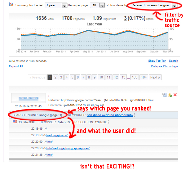
What the Jetpack Site Stats widget looks like on my WordPress Dashboard.
I see this every time I log into my site — AWESOME for a quick glance!