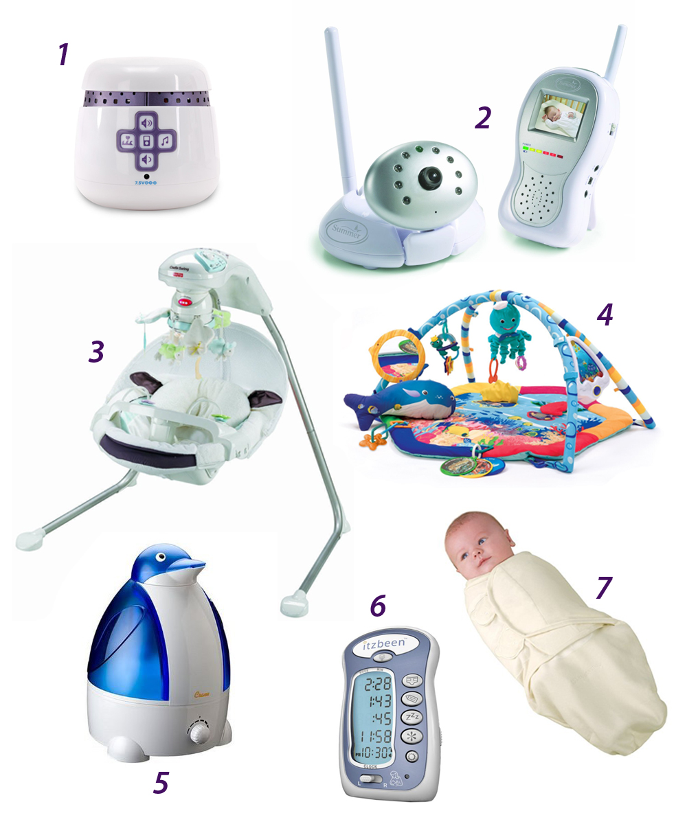
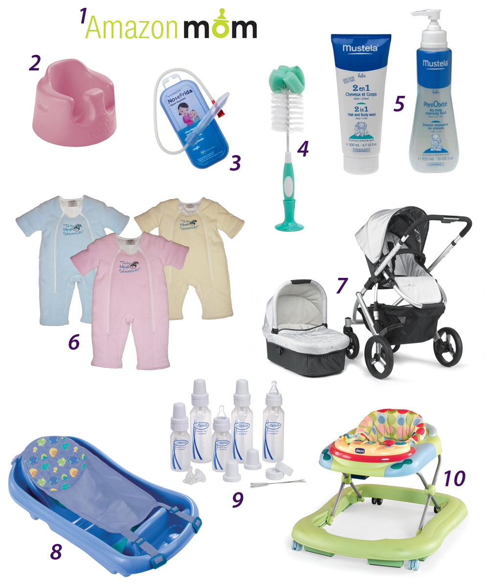
Nov 7, 2008  •  In Art/Design

Picture of the Day

Can you guess what this is?

Via Wired Gadget Lab.

You may also like:

Nov 7, 2008  •  In Blogging

FAQ Page

However small, whenever I make an improvement to this site I want to dance!

The newest addition to this blog is an FAQ page. It is located under the “Navigation” section of my sidebar.

In it, I explain the difference between registering and requesting private access.

I also explain how you can sign up for updates via email. This feature is useful for those who would like to keep updated on my private posts, as they do not publish an RSS feed.

Thanks and please let me know if you have any questions or comments!

You may also like:

Nov 6, 2008  •  In Funny, NYC

Pink Slip Party

A sign of our times?

This is very sad but funny at the same time.

The first-ever Pink Slip Party:

On Tuesday, November 11, victims of the flailing economy can drink their worries away with cheap brewskies, while networking and possibly even getting picked up by a new employer.

Go here to RSVP.


You may also like:

Nov 6, 2008  •  In Funny

Google as Dunder Mifflin

On October 31 2008, Google NYC “dressed up” as Dunder Mifflin for Halloween.

The entire office was decked out as Dunder Mifflin, including name tags (with employees’ names written in pig latin). Unfortunately, I am not allowed to post any further photos of the office.

It’s been almost a full week since Halloween, but it’s better late than ever, right?

You may also like:

Nov 5, 2008  •  In Art/Design, Colors

Top Ten Pantone® Inspired Products

Color has a huge impact on me. I’m pretty certain that I am a tetrachromat. I often find myself mixing interesting colors in my head. I even associate people with certain colors.

Needless to say, Pantone® is a part of my everyday life – both professionally and personally. Pantone’s tagline, “The color of ideas,” is a personal favorite of mine because I hold it and the idea behind it to be true on so many levels. As the world’s foremost authority on color, Pantone has a tremendous amount of control and influence over design and ideas.

Thus, as a tribute to Pantone, I have compiled this list:

Top Ten Pantone® Inspired Products

10. Pantone Cell Phones
9. Pantone Stairs
8. Manetone
7. Pantime
6. Pantone Coffee Mugs
5. MyCuppa Mugs
4. Colorstology
3. Pantone Fashion Color Reports
2. Rubitone
1. Pantone Color Calendar


10. Pantone Cell Phones

Japanese cell phone manufacturer Softbank has created a line of cell phones in 24 Pantone swatches. The specs are nothing special, but they sure are pretty!

Source: http://mb.softbank.jp/mb/en/product/3g/812sh/


9. Pantone Stairs

Featured in French Elle Decoration, this is a colorful, inexpensive, and expressive way to decorate your stairs.

Source: http://www.elle.fr/elle/deco/guide-shopping/tous-les-guides-shopping/detournement-pour-tout-changer/pantone/(gid)/700465


8. Manetone

Artist Tim Fraser recreated Manet’s A Bar at the Folies-Bergère using over 5,000 old Pantone paint chips.

Source: http://www.timfraserbrown.co.uk/


7. Pantime

Developed by student designer James Beattie of Bedford College, UK, Pantime is a timepiece based on the color wheel and Pantone swatches.

Source: http://swissmiss.typepad.com/weblog/2008/10/pantime.html


6. Pantone Coffee Mugs

Caffeine and creativity often go hand-in-hand. What better way to start your day than with your own Pantone swatch-inspired mug? Unfortunately, they are not available in every Pantone swatch, but they are available in two sets: the original and 2008.

Source: http://www.w2products.com/products.builder/pantone.html


5. MyCuppa Mugs

I like these better than the ones above. Because with these, you can turn drinking your coffee or tea into a game of matching hues:

Source: http://www.suck.uk.com/product.php?rangeID=76&showBar=1


4. Colorstrology

I don’t take much in astrology or astrology-related disciplines. However, Colorstrology is a fun Flash site that takes your birthday and gives you a short description of your personality and birthday Pantone swatch. Here is a screenshot of my birthday:

Source: http://www.colorstrology.com/


3. Pantone Fashion Color Reports

Every spring and fall, Pantone releases the Fashion Color Report to coincide with the runway shows. I am no fashionista, but I like to peruse the downloadable PDF for upcoming trends and predictions in fashion. After all, fashion has a way of seeping into general design trends as well. (As a side note, I’m not too crazy about the Spring 2009 colors…what do you think?)

Source: http://www.pantone.com/Pages/Pantone/Pantone.aspx?pg=20619&ca=4


2. Rubitone

I let out an audible gasp when I saw this last week. I just love it when designers/marketers take tried and true concepts to repackage them in fresh and clever ways!

Source: http://ignaciopilotto.wordpress.com/2008/10/26/rubitone-concept/


1. Pantone Color Calendar

I had featured the Pantone Color Calendar on my blog before and I still love it just as much as the day I first saw it. The new 2009 calendar is available on Amazon for $29.95.

I couldn’t find any good pictures of the insides of the 2009 calendar, so these 2008 ones will have to suffice:

Sources: http://www.amazon.com/Moritz-Zwimpfer-Colour-Calendar-2009/dp/3721206584 and http://www.aisleone.net/2007/design/colour-calendar-2008/

You may also like:

Nov 5, 2008  •  In Reviews, Shopping

Comfortable Heels

Although I rarely venture out without heels, I’m ironically not that into shoes.

I am much more of a bag hag than a shoe whore, and until recently never spent more than $100 on a pair of shoes.

My mother stepped in to set me straight. “Shoes are so important to your health! If your feet are not comfortable, your entire body suffers.” She advised me to invest in a few high-quality shoes.

As they say, mother knows best.

In 2006 Cole Haan collaborated with its parent company, Nike, to bring the Nike Air Technology to a special lines of its shoes.


(image via nitro:licious)

I was naturally elated to hear the news, but balked at the price.

I then realized that I go through my shoes like hotcakes. If they did not fall apart after just a few months, I found myself ignoring them for the pain they brought to my feet.

So I decided to give the Cole Haan Nike Air shoes a try.

They’re worth it.

They are the only 3″+ heels that give me no pain at the end of the day. I once walked more than 20 blocks in these shoes, and even the men I was with that night were impressed.

Due to the high price, I only buy one pair a season.

In the past, I threw away shoes when they became worn and torn. But with these, I have them repaired and maintained by a cobbler.

The Cole Haan Nike Air line gets an official seal of approval from the Geek in Heels!

Now, on to boots.

At the start of fall, I wanted to get a new pair of knee-high boots to wear with skirts and dresses in the colder months.

My first stop, of course, was the Cole Haan Nike Air line, but I didn’t see any styles I liked.

I then sauntered into Macy’s one lunch hour and found the Kenneth Cole Landscape Boots.

Expensive, yes.

But they are So. Damn. Comfortable.

This is a huge feat for 4″ heels. Plus, the heels are wide enough for additional support and I do not have to fear for them getting stuck in subway grates.

Not only are they comfortable, they are so WARM and stylish as well.

I initially bought the black ones but picked up a pair in brown too. That’s how much I like them.

So there you have it. The Geek in Heels’ picks for the most comfortable heels.

Do you have any recommendations for comfy heels?

You may also like:

Nov 4, 2008  •  In Blogging, Personal

Changes

You’re probably expecting an election post based on the title of this post. I’m sorry to say this isn’t. The Presidential Election Day is obviously a very important one but I do not like writing about politics or government (I tend to get unpleasant flashbacks of my college days where I was an International Studies major). All I will say is: I have faith that whatever the outcome, it is part of God’s plan and design.

However, I do have some important announcement to make regarding my life and this blog…and as you may have guessed, they are all about change!

1. New Job

Last Wednesday, I gave my two weeks notice at my current company. I had not been actively seeking a new job, but a recruiter contacted me about a marketing/design position at a non-profit foundation.

I feel incredibly fortunate and blessed especially in light of the current economic situation and the dismal job market. At this new company, I will have a lot more creative control, more input, and it’s all for a good cause. Plus, since it is a new position (they had outsourced their marketing before), I will essentially get to create the role.

I will start my new job on the seventeenth and needless to say, I am très excitée!

2. No More Thursday Geek-isms

I pondered over this decision for quite some time. At the end, I saw that my Thursdays have grown too unpredictable. I know that I can move it back to Wednesdays, but I really don’t know how my new job will affect my blogging schedule.

To make up for this cut, I will be writing more short posts dedicated to all the interesting and wonderful things I find on the web.

3. Access to My Private Posts

(Note: this does not apply to those who already have access to my private posts)

In the past, all you had to do was register in order to gain access to my private posts page. Now I have met some fabulous friends through blogging, and so I have no problem with those I have never met in real life reading my private posts…I just want to know your name and email.

I had mentioned several times that I will never share or sell registrants’ names or emails, and that I only wanted to know who is reading my innermost thoughts. However, a few people still decided to make up bogus accounts with obviously fake names and suspicious email addresses.

So in order to take care of this problem, I decided that all readers who want access to my private posts will now need to be approved by me first.

You might have noticed some changes under the “Navigation” section of my sidebar:

If you register for a new account, you can subscribe to site updates via email, are identified uniquely when commenting, and have access to other special site features.

When you request private access, your new account will not be set up automatically. However, just as long as your name and email do not look bogus I will set you up as soon as I receive the notification.

I hope this isn’t too much of an inconvenience. Please let me know if you have any suggestions or comments!

You may also like:

Oct 30, 2008  •  In NYC, Sports

Knicks Opening Game at MSG

Last night, I ran home after work to change into my Knicks jersey – we were going to the Knicks opening game against Miami!

Basketball is my favorite sport, and I’ve been a die-hard Knicks fan ever since high school. It was hard not to be, as the 90s were the glory days of the Knicks (at least in my lifetime) and all of New York was crazy for its boys in blue and orange. Ewing. Starks. Johnson. Sprewell. Houston.

I cried when the Knicks lost the 1999 NBA Championships to the Spurs (and I still have a grudge against the entire city of San Antonio, almost a full decade after the event). I declared that I can now die happy when I ran into Allan Houston at a sports bar and got his autograph.

So when the Knicks announced their schedule for the 2008-2009 season, I begged and pleaded with J to attend more games this year. I guess I am a lucky woman, because he agreed.  🙂

My old Houston jersey is so beat up that the letters are all peeling off. Although Houston had been hoping to return this season, an injury kept him out. So J bought me a new jersey: #42, David Lee!

I was worried that our 300-level seats wouldn’t be too great, but I thought the view was fantastic!

In celebration of the first game, they gave all attendents a free hat. Here I am, happy with my hat and beer.

The Knicks City Kids dancers were so cute and amazing. I told J that when we have kids, we have to make them try out for this.

The halftime show featured Q-Tip…that’s a name I haven’t heard in a while!

D’Antoni seems to have groomed the team pretty well. I know that Miami isn’t a very good team, but at one point the Knicks were up by 21 points!

Alas, either the Knicks got too cocky or they deliberately decided to make the game more interesting. Miami started catching up in the last 8 minutes and at certain points, I was getting pretty nervous.

The Knicks prevailed at the end, winning the game 120-115. Crawford had an amazing 29 points…the man was unstoppable! My boy, Lee, had 16 points, 11 rebounds, and 5 assists.

All in all, a great game. 🙂


You may also like:

Oct 28, 2008  •  In Books

Link of the Day

As a bona fide bookworm, I can’t help but excitedly share this link of the day:

Top 10 Most Outrageous Opening Lines in Literature

If I could add one more, it would be Love Story:

What can you say about a twenty-five year old girl who died? That she was beautiful and brilliant. That she loved Mozart and Bach. The Beatles. And me.

Do you have any you think should belong on the list?


I just wrote another private post. To access it, please register.

(I promise I’ll never spam you or share your name/email…this is just to know who’s reading my personal posts. Be warned, though, that I periodically go through the list and delete accounts that look bogus. Once you log in, you’ll see a link to my private blog under the “Navigation” section of the sidebar.)

You may also like:

Oct 28, 2008  •  In Art/Design, Logos/Branding, Marketing/Advertising

The New Faces of Pepsi and Best Buy

Two of the most recognizable logos in N. America have announced drastic facelifts.

First up is Pepsi.

The new Pepsi logo will be skewed in order to resemble a smile:

Pepsi, Diet Pepsi, and Pepsi Max will have different variations of the smile. According to AdAge, “a ‘smile’ will characterise brand Pepsi, while a ‘grin’ is used for Diet Pepsi and a ‘laugh’ is used for Pepsi Max.”

Over the next three years, Pepsi plans on spending $1.2 billion to change everything about its brands – their looks, packaging, and merchandising.

As if that wasn’t enough, Mountain Dew will be rebranded Mtn Dew (perhaps to appeal to the younger, texting crowd?):

My thoughts on Pepsi’s rebranding: I don’t like it.

Last summer, Coca Cola underwent a redesign and came out triumphant. Taking away the superfluous swishes, swirls, and fizzes, it delivered one of the strongest testaments to its brand in the company’s history.

Perhaps Pepsi was trying to take a cue from its biggest competitor. Citing the current economic situation as the driving force behind the rebranding, Pepsi tries to mimic Coca Cola’s design success and miserably fails.

Sure, the new design is more modern, more chic, more hip. However, those words are not always the best choice of adjectives for a 100+ years old company that is synonymous with American culture.

The new bottles look more like space-age energy drinks, if you ask me.

Let’s move on to the next brand on our list: Best Buy.

From the before and after shots, it is obvious that Best Buy aimed to draw away from its outdated and garish logo.

I actually like the overall look of the new logo. It’s clean, modern, and plays homage to the old logo.

However, something nagged at me as soon as I laid my eyes on the new logo and I couldn’t figure out why.

Then, while searching for images of the new logo, it hit me.

The typeface.

I had written about the power of a typeface before.

In this case, the typeface does not work with the logo.

It is an indecisive font, neither new nor particularly striking. It is inconsistent in its ends and corners, giving the viewer an unsettled feeling.

Too bad, because the rest of the logo isn’t horrible.

What do you think of Pepsi and Best Buy’s new logos?

(via Brand Infection – Pepsi, Best Buy)

You may also like: