This video has been popping up on my favorite blogs since last week, but I haven't had a chance to watch it until now. And it's excellent. One can't help but be utterly impressed with David Fincher afterwards. I don't think the average movie goer notices the things that Tony Zhou points out in the video, even when watching the same flick multiple times. (At least I don't. Do you?) But once you see it, you can't ignore its brilliance. I mean, who knew so much thought and planning goes into each shot, angle, and perspective to get the desired story, mood, and message across to the viewers? So if you have an extra 7 minutes today, I highly suggest you take a look at...
Continue readingIf you've ever used vector graphics programs such as Adobe Illustrator, you probably know what a Bézier curve is. But do you know how they work? (In other words, how your computer draws them?) The following video by Peter Nowell explains just how. It's a geeky "how does it work?" instructional that is sure to captivate illustrators — heck, even those with no interest in computer graphics will find this engrossing! If you want to see more Bézier curves in action, check out these interactive animations by Jason Davies. :-) Via Gizmodo....
Continue readingAt this time 4 years ago, I was admitted to the labor & delivery ward of Holy Name Hospital in Teaneck, NJ. 11 and a half hours later, our Claire Emmanuelle entered this world. I love her for her confidence and sass. I love her for her for her curiosity, intelligence, and hilariously sharp wit. I love her for her passion and tenacity. But who really needs a reason to love her? Sometimes, just loving someone for no reason is enough. Happy birthday, my love. May you continue to embrace life. May you continue to bring laughter and joy to those around you. May you never know a day where you didn't feel loved by God. I love you. Claire's school does a "Montessori Celebration of Life" activity for each...
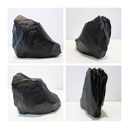
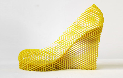
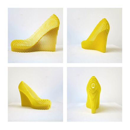
Continue readingMost people would rather forget about their exes, but Sebastian Errazuriz is not like that. You see, the artist’s latest series consists of 12 intricately designed shoes that are meant to reflect 12 of his ex-lovers.
Each shoe, made in conjunction with Melissa (a shoe company that has collaborated with the likes of Vivienne Westwood and Karl Lagerfeld), comes with a short description of, or a story regarding to which the girl it is dedicated. (WARNING: they contain NSFW language!)
Some are endearing, while others not so flattering.
A few are laugh-out-loud funny. 😆
But based on the writing style and its numerous references to sex, I’m sure that a portion of the population would view Errazuriz as nothing more than a chauvinist pig.
Personally, I think each shoe design and its accompanying story are all entertaining in a crude and truthful manner. 😉
Either way, you can’t deny that “12 Shoes for 12 Lovers” is deeply personal and powerful. (And I wouldn’t mind wearing “Laura” or “Jessica”!)
“Honey” Natasha:
You probably presumed from the title of this post that I will be talking about plastic surgery. ;-) Well, you're partly correct. My intention behind this post is to share with you an article published in today's WSJ: "The Changing Face of South Korea," which discusses how Korean faces are changing over time — from tens of thousands of years ago to 100 years into the future. The Korea Face Institute (only in South Korea would such a thing exist :-P ) has taken 20,000 photographs and skull measurements, then factored in interracial marriage, plastic surgery, and nutrition in order to create the following "past," "present," and "future" pictures: The Korea Face Institute's assessment of a typical Korean face in 12,000 B.C. The typical Korean...
Continue reading