I haven’t featured anything logo-inspired in a while, so when I came across this in my Twitter feed, I knew I’d have to share it. 😉
Having worked with branding at a previous job, I can be a bit of a logo nerd; as such, I already knew most of these hidden messages nestled within the logos. But revisiting good design is always a great way to instill and inspire, not to mention the “zOmg that’s so coo!” factor behind some of these ideas!
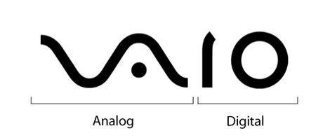
1. Sony VAIO
If you divide the word “VAIO” in half, you can see that the first two letters represent an analog symbol, while the last two are binary. Pretty neat, huh?
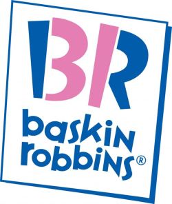
2. Baskin Robbins
This one’s more common-knowledge than the rest. The part of the logo that is highlighted in pink is the number 31, which is the number of flavors the ice cream chain famously offers.
3. Northwest Airlines
This logo has two hidden messages: the first is that you can see both an N and a W within the negative space. The second is harder to spot, but it’s pretty cool when you notice it — the triangle in the circle also serves as an arrow that points northwest.
4. Amazon
Most people believe that the yellow arrow looks like a smile. But if you take into account that the arrow points from A to Z, you can easily see how it represents the wide variety of items and services that Amazon provides, literally from A to Z.
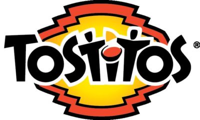
5. Tostitos
The two T’s in the middle show two friends sharing a tortilla chip with salsa!
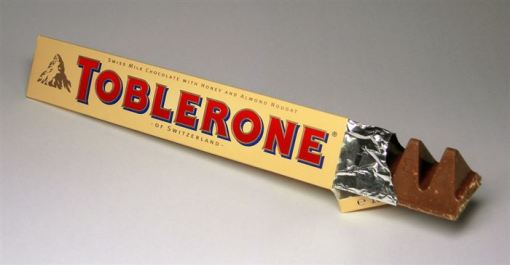
6. Toblerone
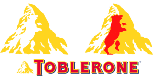
I don’t have much of a sweet tooth, but I love Toblerone. (I refer to it as “The Joey chocolate” — can you guess why? 😉 ) And if you take a close look at the mountain…
Yep, it’s a bear! And the reason for that is because Toblerone originated from the Bern, Switzerland, which is known as the city of bears.
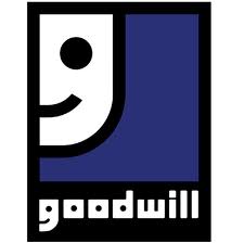
7. Goodwill
Take a close look at the G — it’s a smiling face!
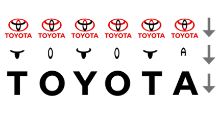
8. Toyota
I always thought that the Toyota logo was a fancy T, so imagine my surprise when I saw that it includes all the letters in the name!
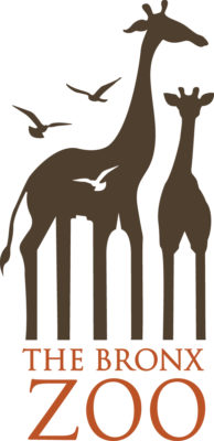
9. The Bronx Zoo
I love this — probably more due to the fact that my older daughter has an insatiable obsession with giraffes — I can’t believe I never noticed the skyscrapers hidden between the giraffes’ legs!
10. FedEx
Can you make out the arrow between the E and the X? It represents the company’s forward-thinking ways and its outlook toward the future.
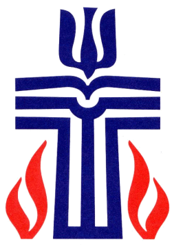
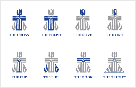
11. The Presbyterian Church (PCUSA)
I’ve grown up with this logo for a great portion of my life, so I couldn’t believe it when I saw its deconstructed form…I love it!
I’ve only listed above my 11 favorite logos from the original article. For the rest, head on over to Diply’s 30 Famous Logos That Have a Hidden Message!




![It's All About Perception [Real Beauty] dove_beauty_sketchs_parody](https://www.geekinheels.com/wp-content/uploads/2013/04/dove_beauty_sketchs_parody-130x130.jpg)
