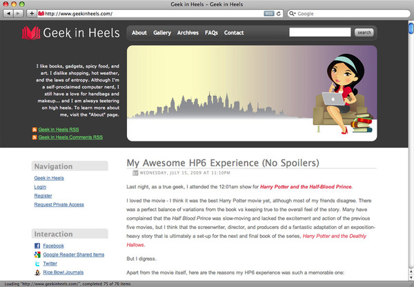
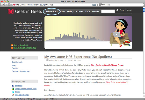
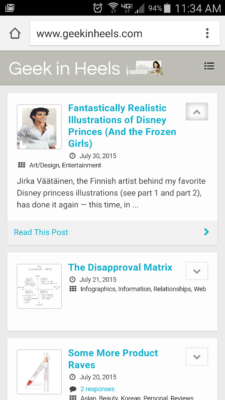
I worked on a new layout over the weekend…what do you think?
The only major difference is the location of my Private Posts. Upon login, the link is now located at the top navigation bar:
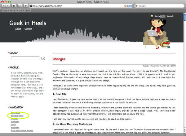
This is what the site used to look like before, with the Private Posts link circled on the left:
A huge thanks to Squarespace – it would’ve taken me at least twice as long to redesign the site without it!
Do you think the new design is an improvement over the last one? I welcome your comments!



 I like books, gadgets, spicy food, and art. I dislike shopping, hot weather, and the laws of entropy. Although I am a self-proclaimed computer nerd, I still have a love for handbags and makeup... and I am always teetering on high heels. To learn more about me, visit the

hi jenny! you are so talented at making webpages 🙂 i wish i could do 10% of what you do!
Aww, thanks Annie! I wish everyone could be as nice and sweet as you!
i helped!!
It looks much better! Very clean.
I want to redo my site layout too, but I need inspiration to slap me in the face first.. plus, I hate tweaking Blogger templates.. LOL