Before making the official switch to Squarespace, I have decided that a site redesign is in order.
I like the current design – it’s cute and minimalistic, which is my style. However, the Geek in Heels girl was bugging me a bit.
I was pretty lazy when creating this blog and so bought this vector image from iStockPhoto:

I hardly ever wear my hair up so I changed the hair, got rid of the glasses (I wear contact lenses), and changed some colors here and there. I changed the laptop into an Apple MacBook Pro, which is the computer I use at home. I also made minor changes to her face to make her look a bit less perky, as I am as boring and monotone as you can get. And most importantly, I made her shoes into high heels.

The main reason the Geek in Heels girl has been bothering me is because lately, I have been seeing more and more sites using the same original image. I wanted to be different.
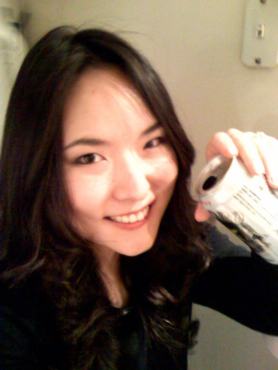
Although my Illustrator skills are a bit rusty, I decided to create a new Geek in Heels girl from scratch, using my own face as inspiration. I decided to use this photo of myself:
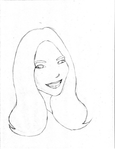
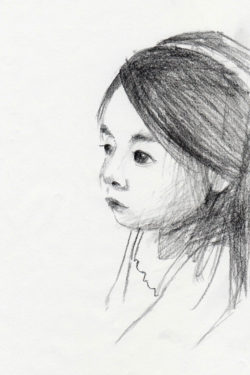
I then turned it into a very simple sketch:
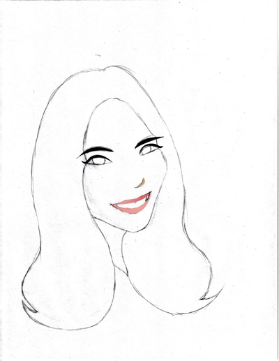
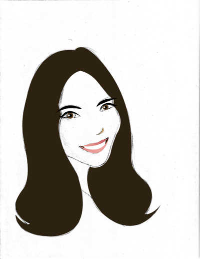
I then scanned the sketch and started the creating the vector graphics by “tracing” over the original sketch:
I did all this using the trackpad on my laptop. When I do graphics work I really wish I had a separate mouse or even a tablet.
The final face:

I’ll probably end up making some additional tweaks since I have yet to start the body. I’m still trying to decide whether to have her sitting or lying on her stomach (posed with a laptop, of course).
Any suggestions? Thoughts?
(ETA: I just showed this to J and he remarked, “But that doesn’t look like you. Where are your freckles?” I guess you can’t please everyone.)



 I like books, gadgets, spicy food, and art. I dislike shopping, hot weather, and the laws of entropy. Although I am a self-proclaimed computer nerd, I still have a love for handbags and makeup... and I am always teetering on high heels. To learn more about me, visit the
