Barack Obama’s 2008 presidential campaign was one of the most prolific and viral in American history.
And never before had a logo been so prominently and massively been used in a presidental election.
Designed by Sender LLC in Chicago, the logo consists of an O with the center suggesting a sun rising over fields in the colors of the American flag:
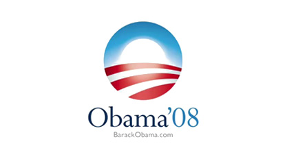
Sol Sender, the creative lead in the Obama ’08 logo, was recently interviewed about the strategy and process behind the project. You can watch the videos here (and I wholly recommend watching the video for all logo/branding freaks like myself).
What I, and LogoDesignLove, found interesting are the other logos that were up for consideration. My two favorites of the bunch that did not make the final three are:
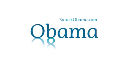
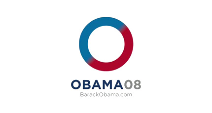
I especially like the clever use of the “Ob” shadowing “08” on the first one!
The three finalists were:
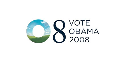
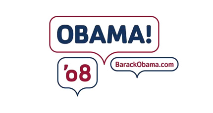
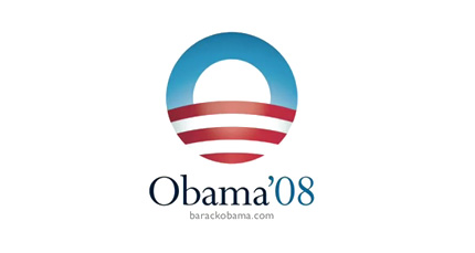
As you can see, the original version of the final logo had a more symmetrical and less friendly feel.
I find it fascinating that the final three are so different from each other. From my experience with branding/logos, the finalists are usually similar, or at least express the same emotion. But the emotions triggered by these three are (in order): optimism, bold playfulness, and a resigned hope.
Needless to say, the final version of the third finalist conveys the one-word slogan “Change” much better than its original.
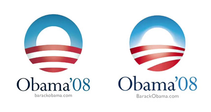
And I have to say this logo is my favorite of the bunch.
Kudos to Sender LLC and the Obama campaign!
[all images courtesy of LogoDesignLove]



 I like books, gadgets, spicy food, and art. I dislike shopping, hot weather, and the laws of entropy. Although I am a self-proclaimed computer nerd, I still have a love for handbags and makeup... and I am always teetering on high heels. To learn more about me, visit the
